


%20(1).jpg?width=950&name=2019%20Typically%20Atypical%20blog%20image%20(1%2c600%20x%20900)%20(1).jpg)
This is not normal. With the capital markets, it almost never is.
Over the long haul, looking backward, stocks have returned a bit over 10% per year and bonds have returned a bit over 5% per year. That said, past performance does not predict future results, as the investing cliché goes. Economists and soothsayers will give their guesstimates for next year's stock market return. For a long-term forecast for financial planning purposes, though, it is fairly common to reduce the backward-looking numbers by a conservative margin. If you have a financial plan where you will have more than enough for the rest of your life, even if future markets are significantly worse than past markets, then perhaps you will be able to see past the noise and focus on your time with your grandchildren.
But, let's talk about the noise for a few minutes. Let's say you hope stocks provide an 8% return over the long-run, plus or minus 5%, and you hope bonds give you 4%, plus or minus 2%. A year like 2019 (so far, knock on wood) would seem like an outstanding one, where stocks are up well over 25% and bonds are up above 6%. Weird, right?!
Well, not really. What would be weird is a year that nails both of those averages at the same time, as you can see in the graph below. Each dot is a year's stock and bond return and the yellow bars are the rough "expected average" ranges I suggested above. I've varied the sizes and shades of the historical dots to bucket them into broad time periods; the bigger/darker dots are more recent. Note that many of the dots are outside of the yellow margin-of-error bars and very few dots fall into the overlapping area of the two bars.
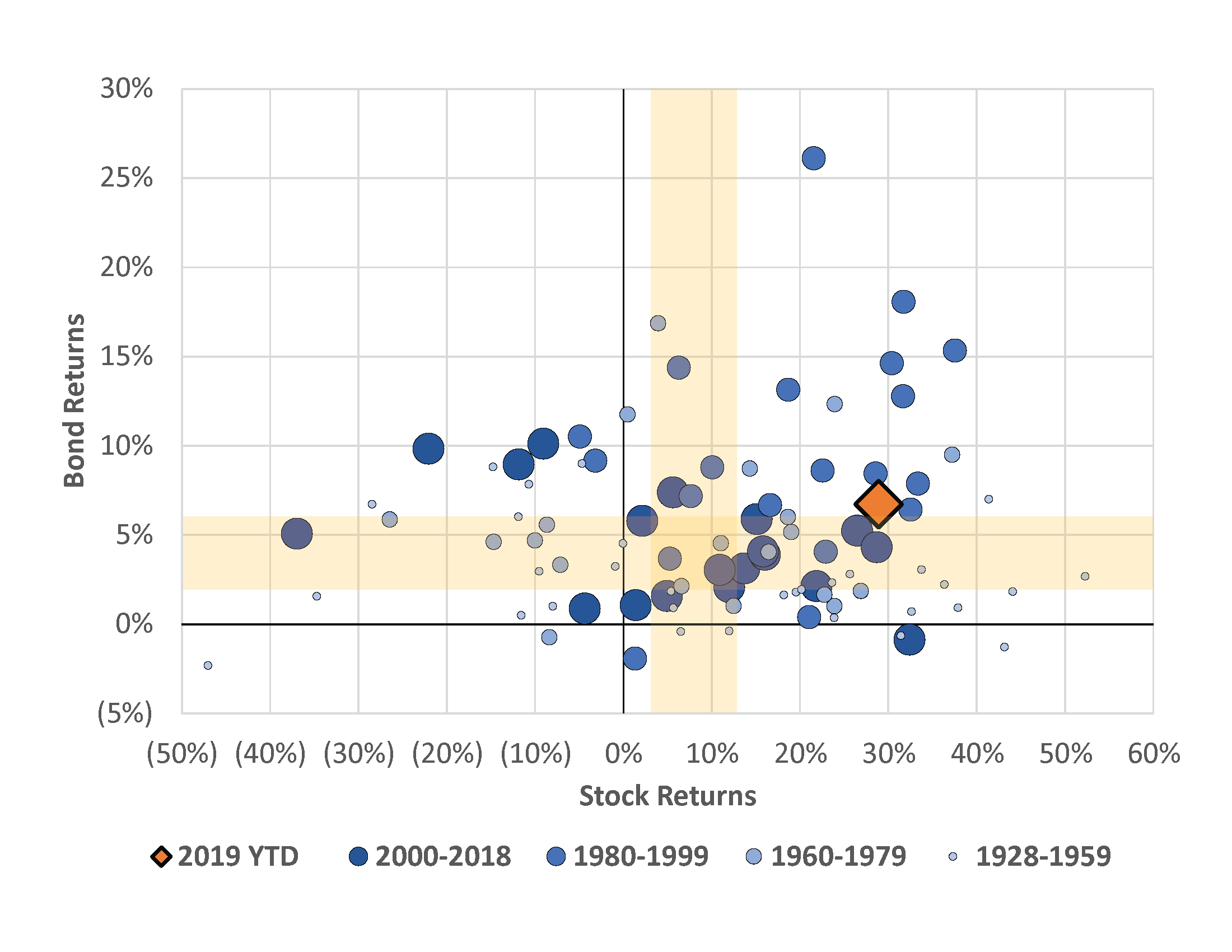
Nonetheless, this year has been strange. The bond market acted as if bad times are coming and interest rates fell, meanwhile the stock market climbed the wall of worry through four quarters of reasonably good earnings. In our office, we're more surprised by the relatively high return of the bond market, as we expected the yield curve to continue its slow climb upward, which would have put pressure on bonds' total return.
The only two years this century that had returns anything like this were 2003 and 2009, where we were exiting and recovering from recessions. Looking back farther, most of the dots in the upper-right of the chart are during the 1980s and 90s, when the bond market was riding the long slide of declining interest rates (a tailwind for bond prices) from the early 80s while the stock market simultaneously enjoyed many good years due to globalization, productivity gains, etc.
So, until the aftermath of another economic shock prompts rampant inflation that leads to interest rates in the teens, we would expect few years to be in the upper-right corner of that chart. In the meantime, let's enjoy the oddball year when we get it, remember to expect the unexpected, and focus on what you can control: spoiling the grandchildren in spite of their parents.

Data Notes: Sources: Bloomberg & Morningstar. Stock returns are the S&P 500 Total Return Index from 1928 to 2019. Bond returns are the Ibbotson Associates US Intermediate Term Government Total Return Index from 1928 to 1973 and the Bloomberg Barclays Intermediate US Govt/Credit Total Return Index from 1974 to 2019.
Andrew Stewart, CFA, CAIA is Chief Investment Strategist at Exchange Capital Management, a fee-only, fiduciary financial planning firm. The opinions expressed in this article are his own.